
Home / Visual Identity
The identity of a district.
Logotype, color, and visual system that give Distrito Palmerola coherence across every application.
Logotype
One brand, two backgrounds.
The logotype pairs the cross-shaped symbol—evoking connection and encounter—with the wordmark set in spaced capitals. It appears in olive on light backgrounds and in white on color backgrounds.
 Primary version · light backgroundWhite version · olive background
 Symbol (isotype) · compact usesWhite symbol · favicon & app
Primary colors
Olive takes the lead.
Olive green is the brand's central color: understated, natural, and timeless. It is complemented by a warm neutral palette.
Colors by use
A color for every zone.
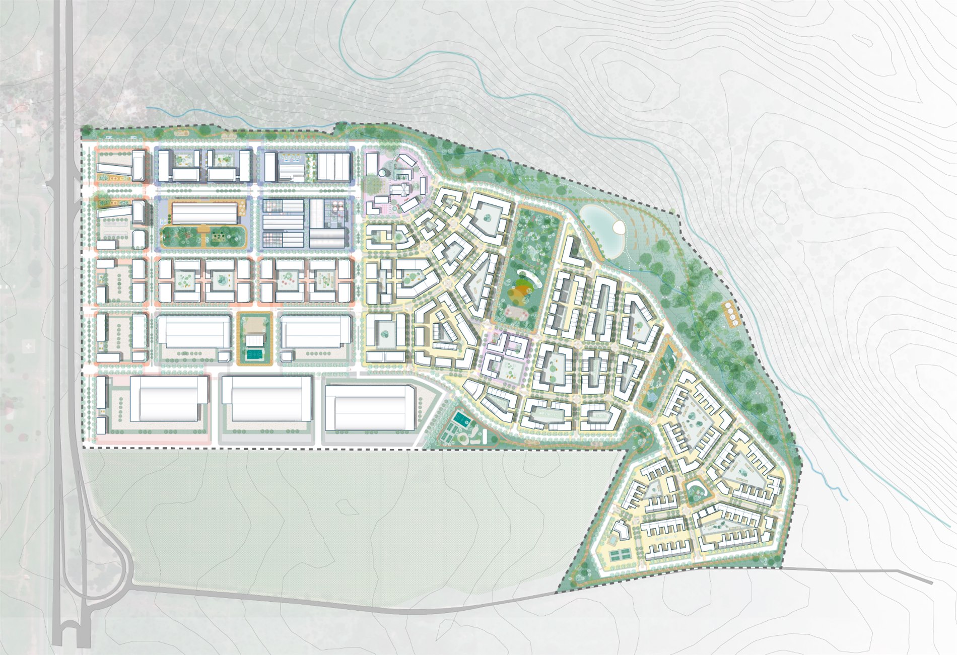
The master plan is read through color: each land-use category has its own tone that organizes the plans and the district's communications.
Typography
Geometric and clear.
The brand uses a geometric sans-serif typeface, fine in stroke and wide in its capitals, conveying order, modernity, and calm. On the website it relies on Jost for headlines and Inter for body text.
The result is a clean, contemporary read, consistent with the district's serene character.
abcdefghijklmnñopqrstuvwxyz 0123456789
Let's talk
Ready to learn more?
Request the project's complete brochure, with the master plan, the phases, and the investment options.